


How to Use the Opposite of Orange in Photography
Unlock the power of color theory by exploring how to effectively use the opposite of orange in photography for striking visual contrasts.
Learn | By Ana Mireles
Blue is the opposite of orange on the color wheel.
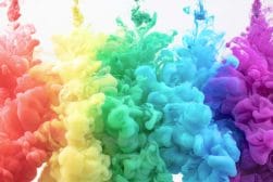
In color theory, orange and blue are one of the most common color combinations in photography.
When you use complementary colors in your photography or design, everything immediately looks better.
However, you need to know how to use blue and orange properly.
In this guide, I’ll show you exactly when and how to use orange and blue tones to improve your images.
Table of Contents
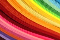
Orange and Blue C0l0r Theory Basics
As a photographer, I’m sure you’ve heard a lot about the RGB color model. Here, red, green and blue are the primary colors.
However, if you dig deeper into your memory, you may recall in your early years learning something different. In school, they teach us the primary color model, where the primary colors are red, yellow, and blue (RYB).
To teach you this, they probably gave you paints that you could mix. As you mix the three primaries, you create colors that are known as secondary – orange, green, and purple.
So, which one is right, RGB or RYB? Well, all of them are right.
The thing is that RYB is based on subtractive colors. This system subtracts wavelengths of light when you mix each layer of color – which is why it’s called subtractive. Instead, RGB is based on additive colors.
RGB is used on monitors, while RYB is more common when combining pigments. Still, when it comes to finding a good combination, the RYB color model is the most common – even if you’re working with digital photography.
You should also read our guides on sRGB vs. Adobe RGB and why you should use SRGB on your computer monitor.)
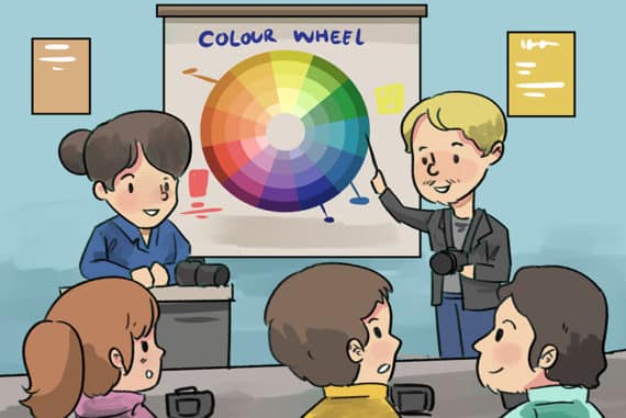
The easiest way to understand how to use the RYB model is to use a color wheel. This way, you have an illustration where you can see how colors interact.
You can form a color wheel by placing the primary colors like forming a triangle. Then, add the secondary colors forming an upside-down triangle.
This way, each primary color has a secondary color opposite to it – these are known as complementary color pairs. Then, you can add tertiary colors and even add gradients in between to cover different tones.
Arranging the colors this way, you’ll have blue opposite orange. This often confuses people because, in the RGB color wheel, green would be the opposite color of orange. This color scheme can work too, but it’s not the one we’re focusing on today.
Complementary Colors: Why Blue looks great with Orange
We’ve already established that using the RYB method, blue is opposite to orange. This makes them complementary colors. But why does this mean that they look great?
Colors opposite to each other in the color wheel are a natural fit. Since they create such a strong contrast, they make each other pop.
Specifically speaking, blue and orange are not just contrasting in color but also in the mood and concepts they represent.
Due to color psychology, we know that blue is peaceful or sad while orange is vibrant and exciting. Blue is also colder, not just in temperature but in feelings, while orange is warmer.
How Analogous and Monochromatic Colors Enhance an Image

Credit: Shobhit Bajpai (left) / Allan Franca Carmo (right)
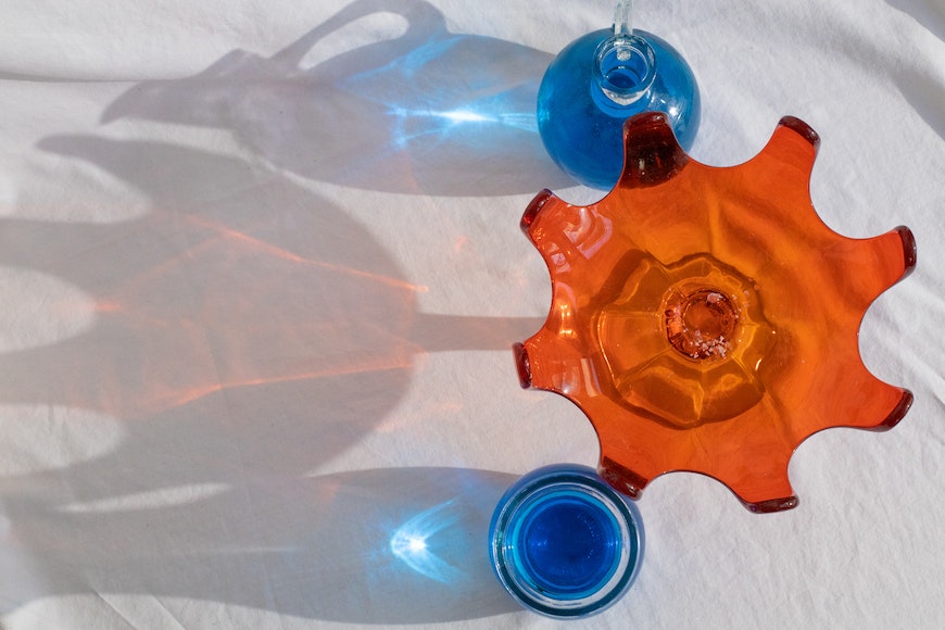
In this article, we’re focusing on the complementary color theory. However, it’s important to mention that this isn’t the only way to combine colors in a successful way.
You can also use analogous colors to create a monochromatic scheme. This means that instead of pairing blue and orange, you should pair orange with other orange tones and blue with other blue tones.
Analogous colors create a natural and harmonious look that gives your photographs a subtle elegance.
Why Should You Use Orange and Blue in Photography?
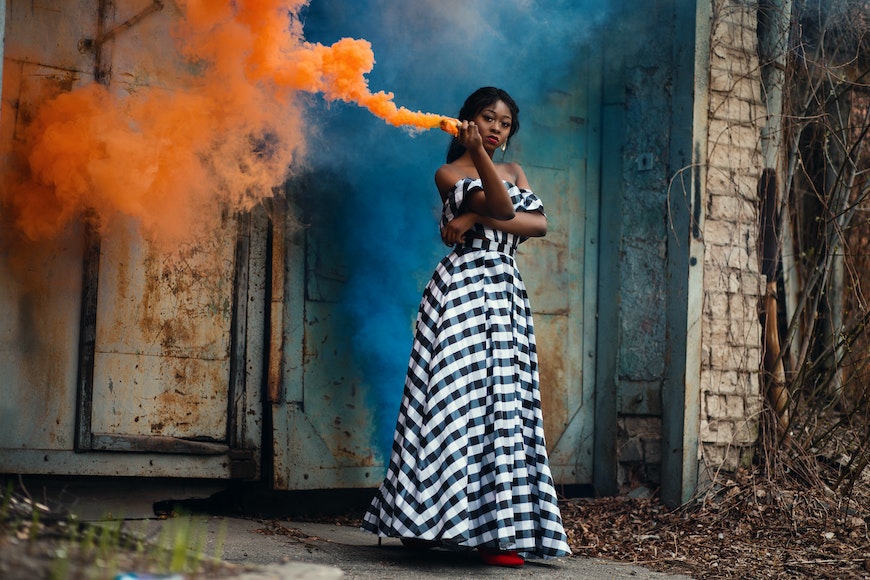
Credit: Godisable Jacob
Now that you know what color compliments orange, here are a few reasons why you should use it.
Grab the viewer’s attention
By pairing the colors orange and blue, you’re creating a strong contrast that’s guaranteed to grab the viewer’s attention.
Make a bold statement
Using blue and orange makes a statement. If we refer to color psychology, orange equals confidence, success, bravery, and sociability. Blue is associated with trust, peace, loyalty, and competence.
Artists have used this combination to communicate their messages many times. You can see this in graphic design as well by analyzing the logos of companies like Fanta or Firefox.
Create a mood
Blue and orange are two colors easily associated with different moods. If you’re feeling down or depressed, you say that you’re feeling blue. This is communicated through photography as well.
Instead, using orange as the color temperature of a scene makes you feel cozy or excited.
Add context
Blue and orange help you to give context. These colors are associated with a time of day – blue is the evening or before the sun rises, while orange goes with sunrise or sunset. This is related to the color temperature of the sunlight.
They’re also associated with a physical temperature. When something is blue, we immediately know it’s colder, while orange is associated with fire – therefore, with warmth.
How to Incorporate Blue with Orange in Your Photos
Here are a few ideas on how to use these colors in your photographs.
Background vs subject
Credit: Andrea Piacquadio
When you want to use the blue-orange color scheme, the easiest way is to assign one of them to the subject and the other to the subject.
This way, you’ll be sure that your subject will stand out.
Use the sky
Credit: Todd Trapani
Speaking of backgrounds, the sky can be a good option. If your subject is orange, you can use the blue sky. To do it the other way around, you can shoot at sunset to use the orange hues of the sky to make a blue subject pop.
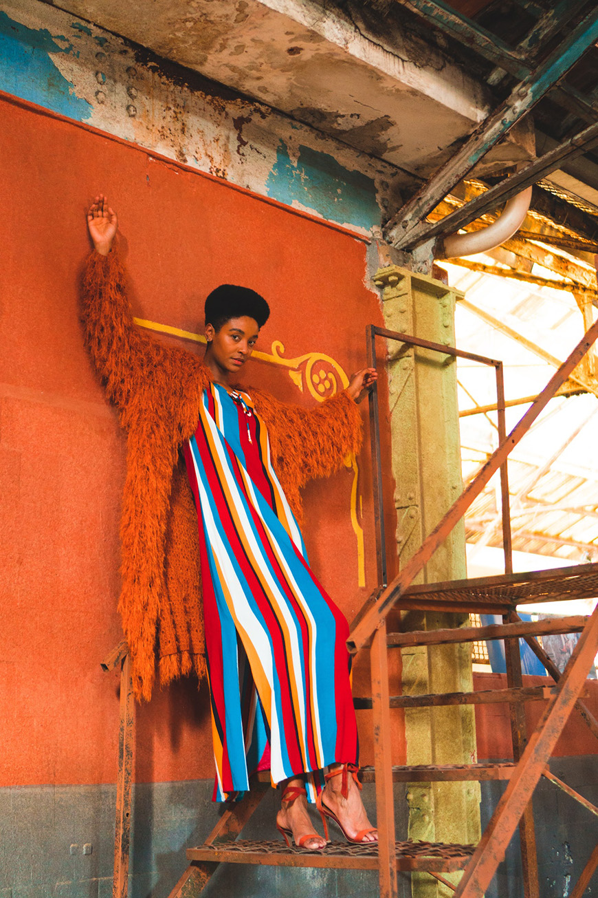
Props
Credit: Miriam Alonso
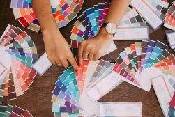
Choosing your props using the color wheel is always a good idea. In this case, pairing orange props when your model is wearing blue or vice-versa is a successful combination.
Use color gels
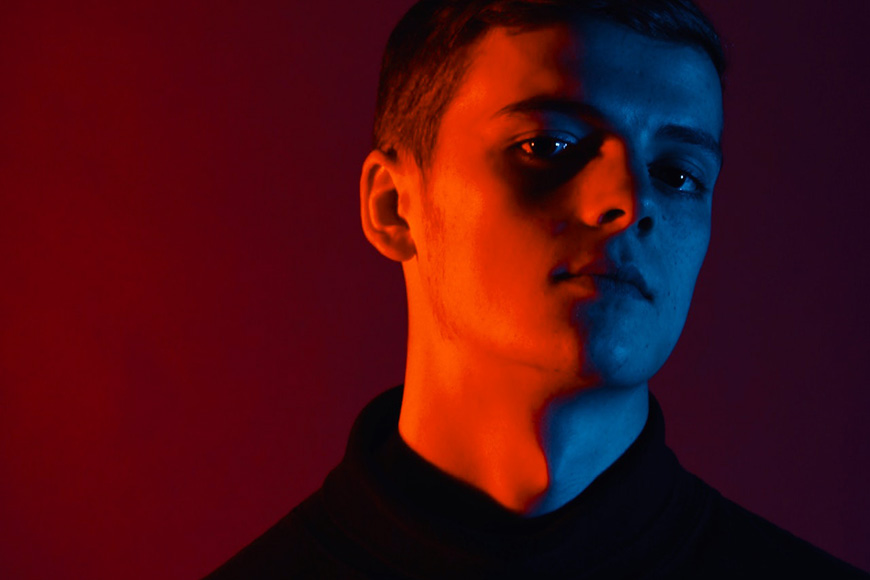
Credit: Jack Winbow
As you know, light can have different colors because of its color temperature. However, you can still modify it and make it more colorful by using color gels.
You can use blue gels if you have an orange subject or background, and you can use orange gels for blue items.
It’s also possible to use complementary color schemes if you use multiple light sources – for example, adding an orange gel to one flash and a blue one to the other.
Blue and golden hour
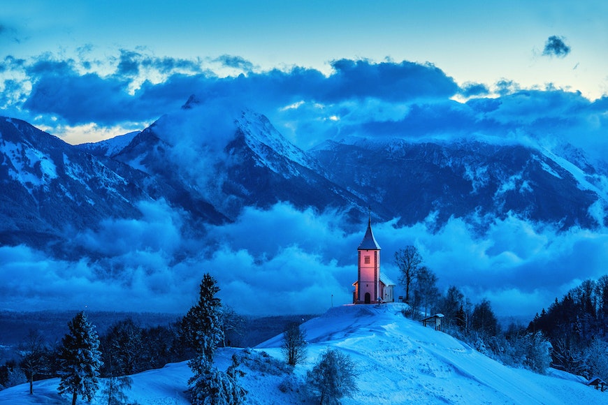
Credit: Janez Podnar
You can use the natural color temperature of the light to incorporate these colors in your photos.
The time before sunrise and after sunset is called blue hour because of its bluish tones.
Instead, the time after sunrise and before sunset is known as the golden hour due to its warm tones.
Try different shades
Credit: Allan Franca Carmo
You don’t need to use the exact opposite for the complementary color scheme to work.
You can try other colors that are on the opposite side while not on a direct line.
You can also maintain the blue-orange combination but change the saturation or temperature of each one to add variety.
How to Edit Photos Featuring Complementary Colors
Here are some tips to highlight the complementary color schemes in your photos.
Color grading
Color grading allows you to adjust the hue and saturation to a specific area of the image based on its brightness. A common color grading scheme based on complementary colors is orange and teal.
Most photo editing programs allow you to do this. Often, the tool is called color-split. I recommend using Lightroom’s color grading tool because it’s intuitive and gives you further control
Filters
There are many filters, presets, overlays, and actions available that work specifically with complementary colors. You can find them by color but also by the effect.
Look at cinematic filters to look for the one you want. Hollywood is full of examples that use blu and orange as color schemes – Bourne Identity, Blade Runner 2049, Tron, Transformers, etc. So, you’ll find plenty of cinematic filters for your photos.
Color Isolation
You can do local editing based on colors. Isolate the orange and the blue on your photographs to change their hue and make them more vibrant or saturated shades. You can do anything you want.
You can also leave them colored while you desaturate the rest of the image. This look was a very popular trend a few years ago. There are some dedicated apps on the Apple Store and Google Play store.
Pitfalls to avoid
Over-saturating your colors may be counter-producing. Instead of making a harmonious palette, it may be too obvious or unnatural – causing the viewer to dismiss your image quickly.
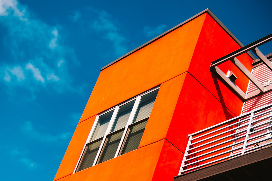
Other FAQs About the Colors Orange and Blue
Credit: Jill Burrow
What color compliments rust orange?
Rust is a deep orange hue with a hex code #C45508. Its complementary colors are blue shades with lots of cyan, such as new bridge or seaweed, blue-green tones and darker shades.
What colors do not clash with orange?
All orange hues work well together, so you can create a monochromatic palette with red-orange, burnt orange, bright orange, yellow-orange, etc. And they won’t clash.
Another option is to use the opposite of orange in the color wheel. This means that different shades of blue such as blue violet, blue green, indigo blue, and similar tones, won’t clash with the color orange.
Neutral colors are also a good match, for example, off-white or charcoal grey.
Why is blue the opposite of orange?
Blue is the opposite color of orange when they are arranged in the color wheel. This is because of the color theory developed by Goethe, Newton, and other theorists.
What colors go well with orange?
You can use different color harmonies to find colors that go well with orange. In the analog scheme, the color orange goes well with other orange hues. If you use complementary color harmony, then you can use the opposite color on the color wheel.
So, the color orange goes well with red-orange, fiery orange, burnt orange, blue-green, and other blue shades.
What color contrasts red orange?
Pairing orange with blue is always a good match. however, you can also contrast red-orange with black or with yellow-green.
What color is the opposite of light blue?
The opposite of light blue is neutral warm colors like brown or beige. The complimentary hex codes are #997754 and #E6C9AC.
Do opposite colors complement each other?
Yes. The complimentary colors theory says that colors that are opposite to each other in the color wheel will complement each other.
What are the 3 best colors that go together?
You can create a three-color scheme using the primary colors – red, yellow, and blue or red, green and blue. If you’re looking for a three-color scheme opposite of orange, you can use the split complementary harmony – for example, orange, indigo and aqua.


WELCOME TO SHOTKIT
Enter your email to be sent
today's Welcome Gift:
19 Photography Tools
🔥 Popular NOW:


Shotkit may earn a commission on affiliate links. Learn more.